I love forecasting trends, and one of the most enjoyable challenges I face in my career is repositioning something seen as mass or forgettable into something premium and desirable by exploring wider cultural phenomena that surround the category. Fashion is a particularly interesting category to do this in.
Related Article Block Placeholder
Article ID: 324806
For the last nine months, I’ve been working away on rebranding an iconic Australian shoe brand, Betts. Founded in 1892 by Fanny Breckler, Betts is fifth fifth-generation family-operated and owned, with me as the only external shareholder.
Upon joining the team, I knew I had my work cut out for me. Betts, a stalwart of every millennial childhood, had lost its way. Not unlike many other heritage brands that have weathered more storms than those of us with infantile businesses by comparison could ever conceive of.
Despite the surmountable challenges legacy brands face due to the ever-changing landscape they operate in, they possess something young labels would kill for: legacy and history. The job of a rebrand or repositioning isn’t to erase that memory; it’s to make it feel current without severing recognition.
So how does a brand that is drowning in its own history come up for a breath of fresh air?
Smarter business news. Straight to your inbox.
For startup founders, small businesses and leaders. Build sharper instincts and better strategy by learning from Australia’s smartest business minds. Sign up for free.
By continuing, you agree to our Terms & Conditions and Privacy Policy.
Let’s explore four recent examples of brand repositionings.
Oroton (2022)
Oroton is a case study in respectful reinvention. After a voluntary administration in 2017, new leadership backed a creative reset under Sophie Holt (ex–Country Road). The refresh expanded beyond bags into ready-to-wear, elevated materials and craft, and rebuilt a coherent “modern classic” world: logo, typography, product, and imagery all singing the same song. Holt summed up the task of making a brand “with such history and quality…relevant to a modern customer”.
Related Article Block Placeholder
Article ID: 308160
What mattered: the team didn’t discard equity. Oroton’s heritage monogram, serif wordmark and warm, tactile imagery were reinterpreted (not replaced), creating distinctiveness online and in-store. Public reporting has credited the shift with renewed momentum, including double-digit growth periods as the repositioning bedded in.
Takeaway: Evolve the codes your loyalists already love; don’t start from a blank page unless the equity is truly toxic.
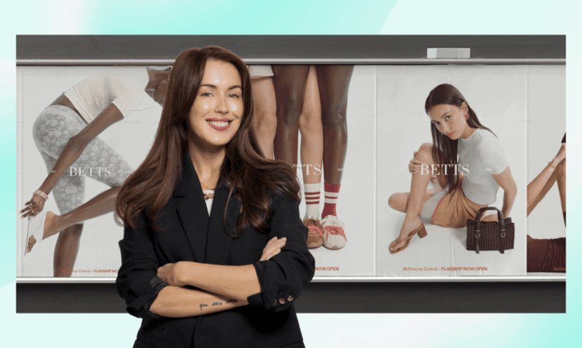
Betts (2025)
Betts, a brand with a beautiful soul (pardon the pun), had lost its way with a muddled and “catering to everyone” position in the market. A strategic recommendation I made was to retire men’s and kids’ to focus on women, along with moving away from discount-led to “mastige” (affordable luxury) that tapped into the brand’s archive in the right way.
An image from Betts’ new brand positioning campaign. Source: Supplied
Along with that, with Willow & Blake’s hands guiding us, we rebuilt the full funnel, product architecture, pricing, retail theatre, and storytelling around a simple line: Shoes change everything. The principle mirrors Oroton’s path: mine the archive for meaning, then modernise the codes so they work across performance channels, retail, and brand film.
Takeaway: If you’re re-positioning price and product simultaneously, align all touchpoints, including merchandising, photography, copy and CRM, so the promise holds everywhere, not just in the logo. It can take a lot to turn around a ship that has become reliant on promotional schedules, so patience is key when attempting a repositioning of this size.
Burberry (2023–24)
Under Daniel Lee, Burberry re-embraced its equestrian knight, a serif wordmark, and unabashed Britishness, distancing itself from the Helvetica sea of sameness that had taken over the luxury houses in the 2010s, then pushed them through pop-tinted campaigns and retail takeovers.
Related Article Block Placeholder
Article ID: 323137
The shift aimed to reassert luxury distinctiveness and accessories growth by clearly claiming what it owned — British Heritage — accompanied by bolder price and distribution moves. Early signals suggested a renewed cultural buzz and a clearer house code system globally.
The reinvention of the logo of various luxury brands. Source: Supplied
Takeaway: For luxury and “heritage-adjacent” brands, archive assets can be jet fuel if you deploy them with modern energy.
Pepsi (2023)
Not a fashion brand, but a brand that deployed the same tactics by tapping into people’s fondness of nostalgia. Pepsi’s first new logo in 14 years brought back the confident, centre-set wordmark inside the globe and amped up contrast for a screen-first world. The company described it as an identity made for “an increasingly digital world,” leaning into ’70s–’90s equities with a contemporary pulse.
Takeaway: Look outside your category for inspiration when it comes to successfully reviving heritage brands.
The through-line? Great rebrands preserve memory while upgrading meaning. Do that, and your past becomes a competitive advantage, not a constraint.