Few public brands have ever garnered as much unbridled popular affection as the London underground. From the moment that architect Leslie Green unleashed his first station facades of gleaming oxblood-red terracotta tiles on to the streets of Edwardian London, the tube has offered a masterclass in the power of design to represent a truly public service.
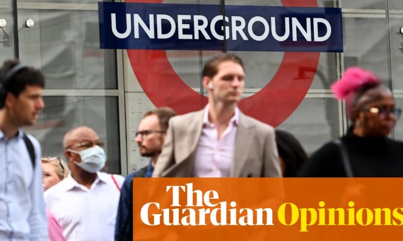
The famous roundel badge, designed by 1917 by Edward Johnston, who also created the network’s classic typeface, has become one of the most recognisable logos in history. The tube map, first drawn up by Harry Beck in 1933, is a stunning model of stripped-back clarity that has influenced transport maps the world over. The graphic moquette seat fabrics, introduced in the 1920s, are so adored that they now cover cushions, scarves and tote bags. To this day, the overall design of the Transport for London (TfL) network is an essay in legibility, consistency and coherence, enjoying a level of brand recognition that is the envy of corporations the world over. It is a visual identity that ties the entire city together, more than any urban branding exercise could ever hope to achieve.
Now that cohesive design hangs in the balance. Last week, in a short LinkedIn post, TfL offered an opportunity for the “exclusive sponsorship” of the Waterloo & City line, in a deal that “goes far beyond a typical media opportunity”. The “full-line branding”, it continued, will extended “from moquette seat fabric and signage to maps and experiential spaces”, offering brands the unique chance to “own the journey” from Bank to Waterloo – a route plied daily by thousands of the Square Mile’s high-net-worth decision-makers. “Ready to create standout, shareable moments on the underground?” the post asked, with a little red heart emoji.
The cash-strapped tube operator is no stranger to branded takeovers. But this latest move represents by far the most complete submission to commercial sponsorship, opening the doors for private funds to creep ever further along the network, and to shrink-wrap every available surface of the commute in monetised messaging.
Conservative mayor Boris Johnson was the first to begin the great sell-off, when his costly cable-car vanity project was rebranded as the Emirates Air Line in 2012. The deal saw a private company’s name adorn the tube map for the first time, for the price of £3.6m a year. The value of this novelty soon wore off, once it became clear that few regular commuters took the ride. The current sponsor, IFS, pays just £420,000 per year for the naming rights to the mostly empty dangleway.
More recently, TfL raised eyebrows last year when it plumbed the uncharted depths of immersive advertising by changing the actual names of two tube stations. The half-a-million-pound deal saw Bond Street renamed Burberry Street, and Old Street rebranded Fold Street, to mark the launch of a Samsung phone, each for a few days. The publicity stunts were slammed at the time by Transport For All, an organisation representing passengers with disabilities, which said that “thoughtless PR stunts being used to plug holes in TfL funding cannot be at the expense of accessibility and safety for disabled passengers”.
Last week’s announcement has raised similar concerns. The Greater London assembly’s Liberal Democrat leader, Hina Bokhari, described the decision as “a disgrace”. She said: “Rebranding stations may seem like a bit of harmless fun, but for neurodivergent Londoners and visitors, of whom there are many, it can cause genuine confusion and distress.”
Alongside raising questions of accessibility, the latest move goes against the very essence of what makes the tube so beloved, and so successful – both as a brand, and as a shared public service in Londoners’ collective psyche. In our increasingly privatised capital, where streets are patrolled by the guards of business improvement districts, and outdoor space is often only publicly accessible at the invitation of private landowners, the public transport network is one of the few lasting bastions of a civic commons. And its clear visual identity, free from wraparound vinyl decals, sponsored seat covers and “experiential” marketing installations, has been central to its success as a beloved public service.
Much of the power of the tube’s identity can be credited to Frank Pick, who shaped the look of the tube network in the first half of the 20th century, and saw good design and visual clarity as a public duty. A solicitor turned publicity officer, Pick understood the power of total design, from the architecture of stations to the look of the signage, to the design of the posters promoting far-flung places that were now in reach, thanks to the miracle of the electric railways. He was the one who commissioned Johnston’s roundel and endorsed Beck’s map, as well as hiring architect Charles Holden to design a series of strikingly modern stations in the 1920s and 1930s, such as Southgate’s art deco UFO. In Pick’s eyes, design was not just a matter of aesthetics, but an essential tool for elevating the everyday passenger experience and contributing to the overall quality of city life.
“The test of the goodness of a thing,” said Pick, “is its fitness for use. If it fails on this first test, no amount of ornamentation or finish will make it any better; it will only make it more expensive, more foolish.”
TfL’s attempt to flog the Waterloo & City line might plug the funding gap for a few months, but it is a foolish sticking plaster that could ultimately do more harm than good. Commuters can look forward to a future of riding the Nike Northern Line, with an air-cushioned spring in their step, or taking the Amazon Prime Piccadilly, making you take journeys you never knew you needed.